Berry Blue,
A collective of make-up artists
Concept & Branding
Berry Blue is a collective of makeup artists, or rather
"beauty experts," in Belgium. They offer a wide range of
services, from skincare and makeup to hair salon and nail
care, and even complete bridal looks. Berry Blue was created
to be fully responsive to their customers' wants and needs,
providing them with an unparalleled experience.
I created this project during my admission to Maister.
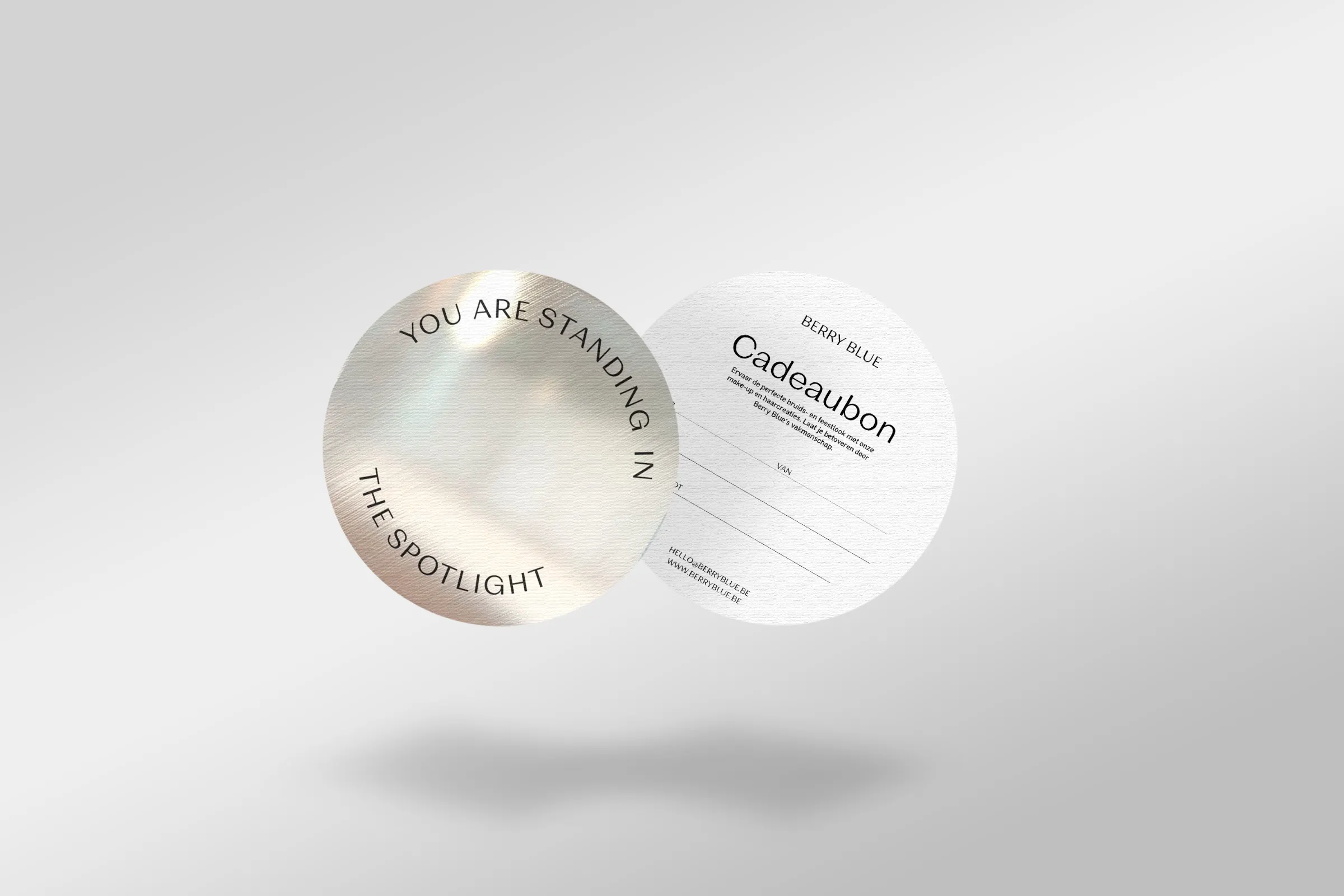
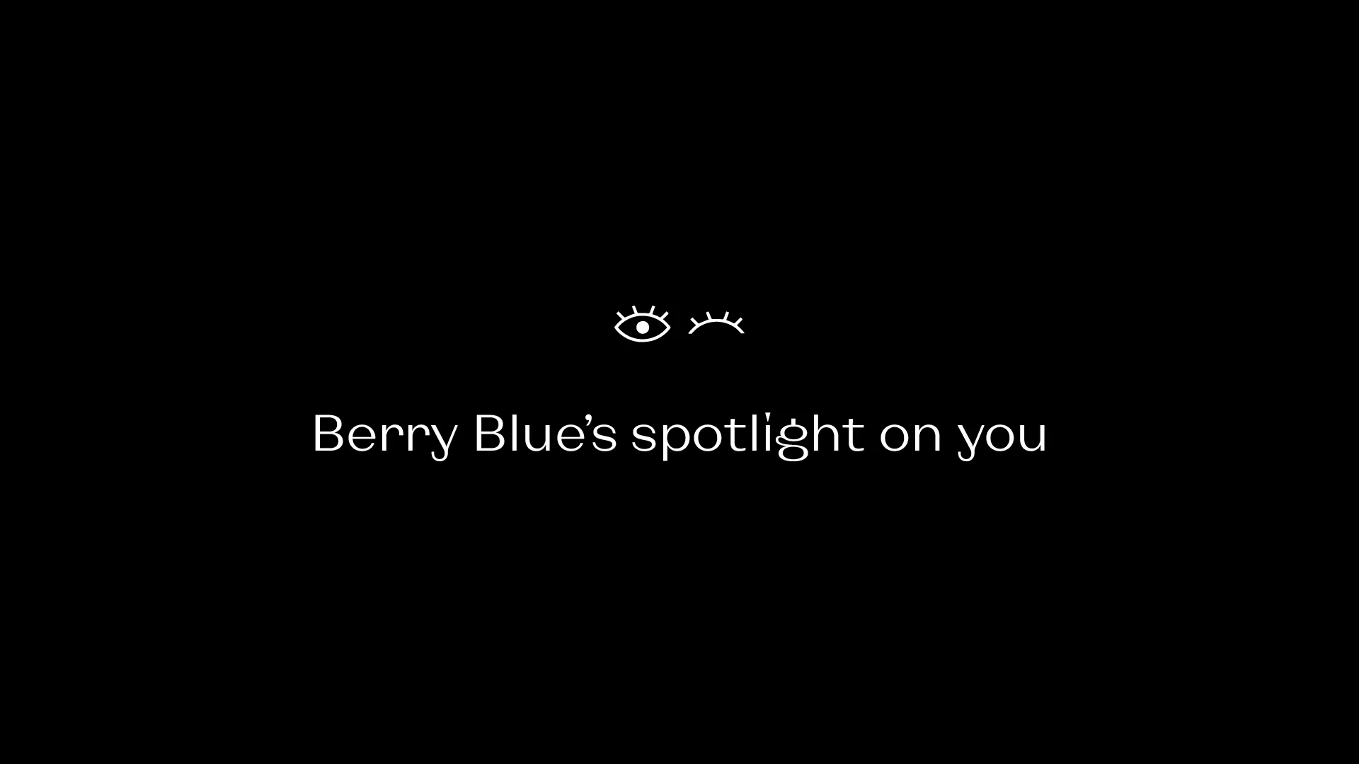
At Berry Blue, the customer is always the priority. That's why
we chose the overarching concept of "spotlight": putting the
customer fully in the picture.
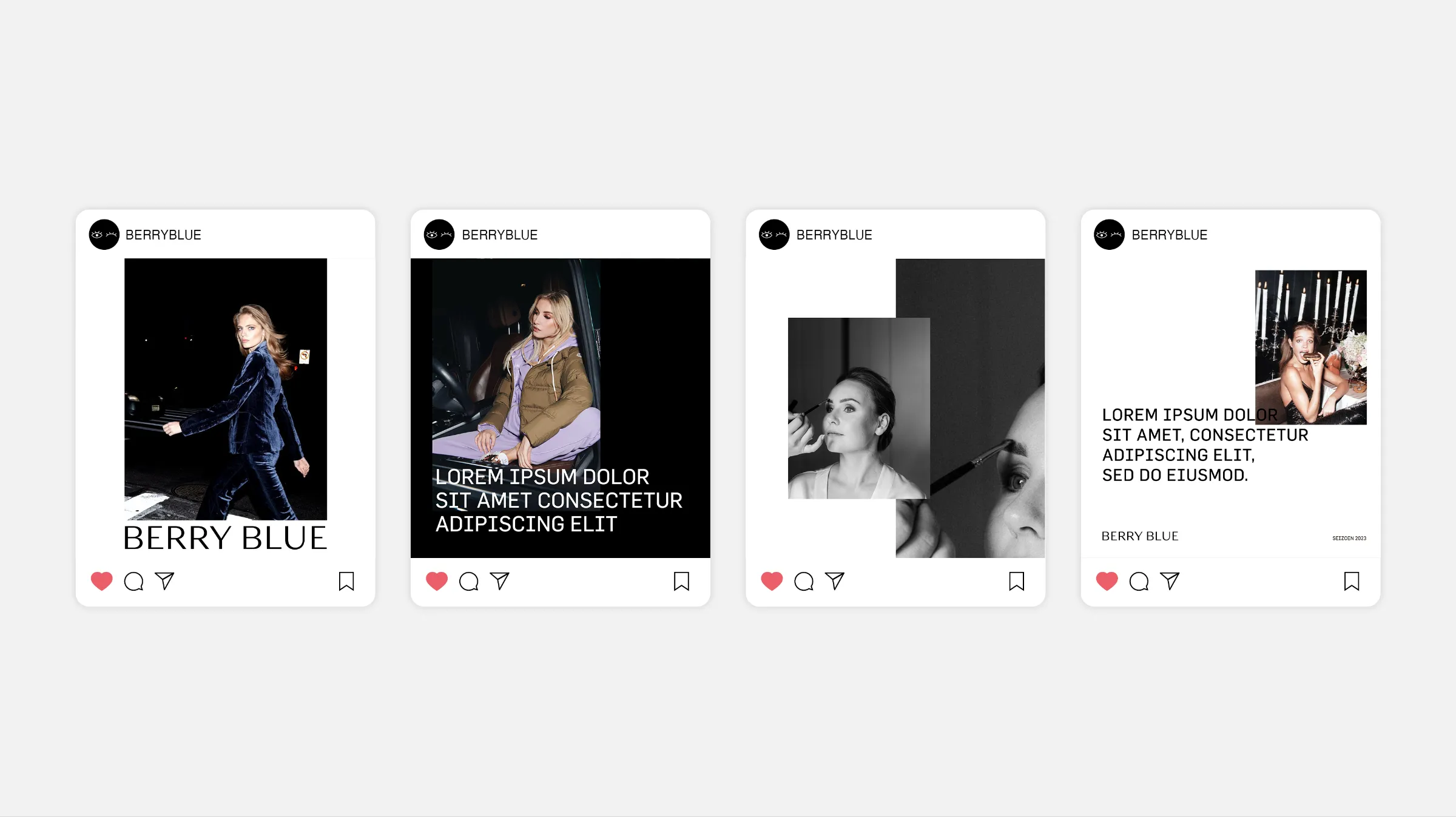
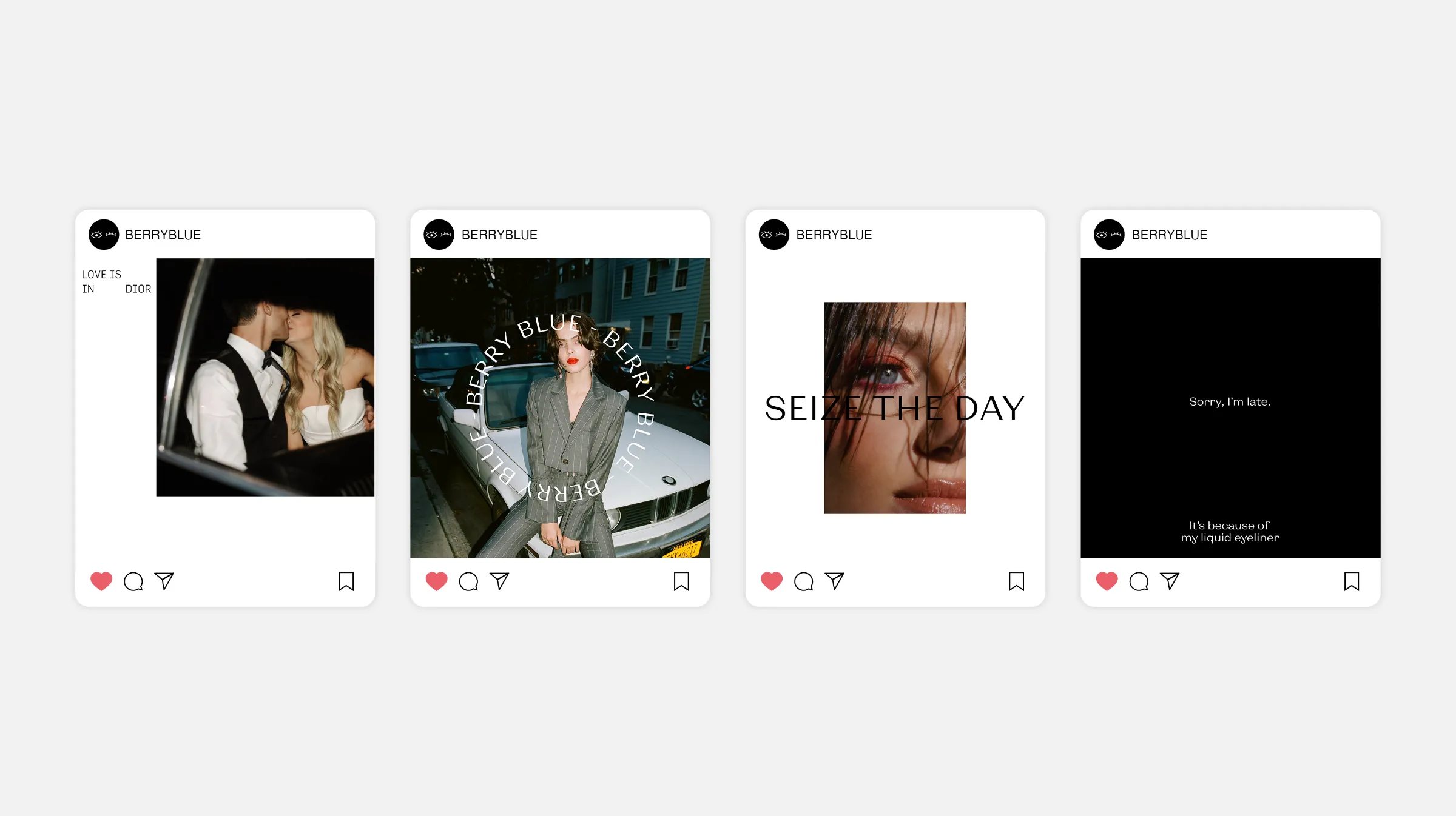
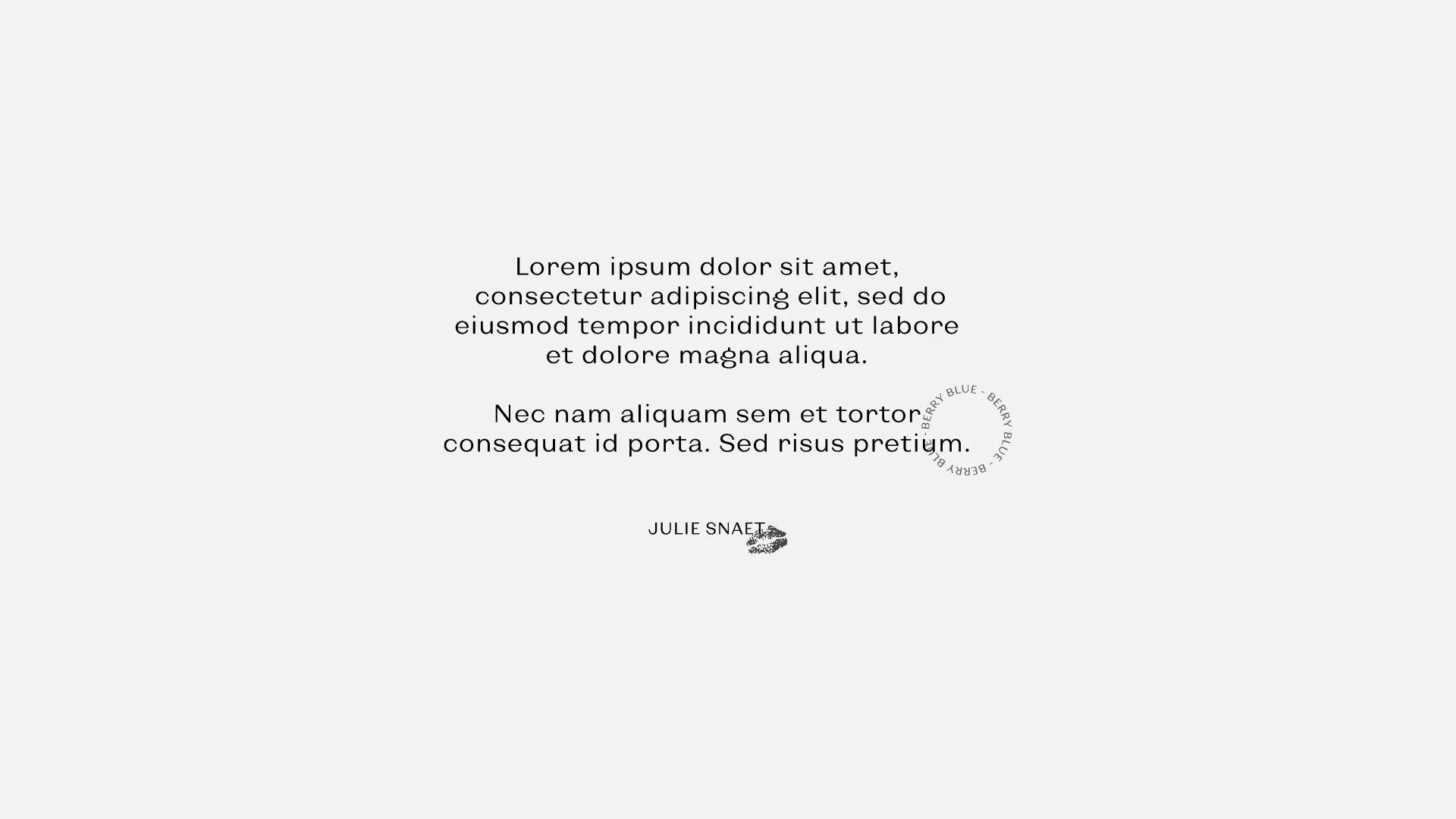
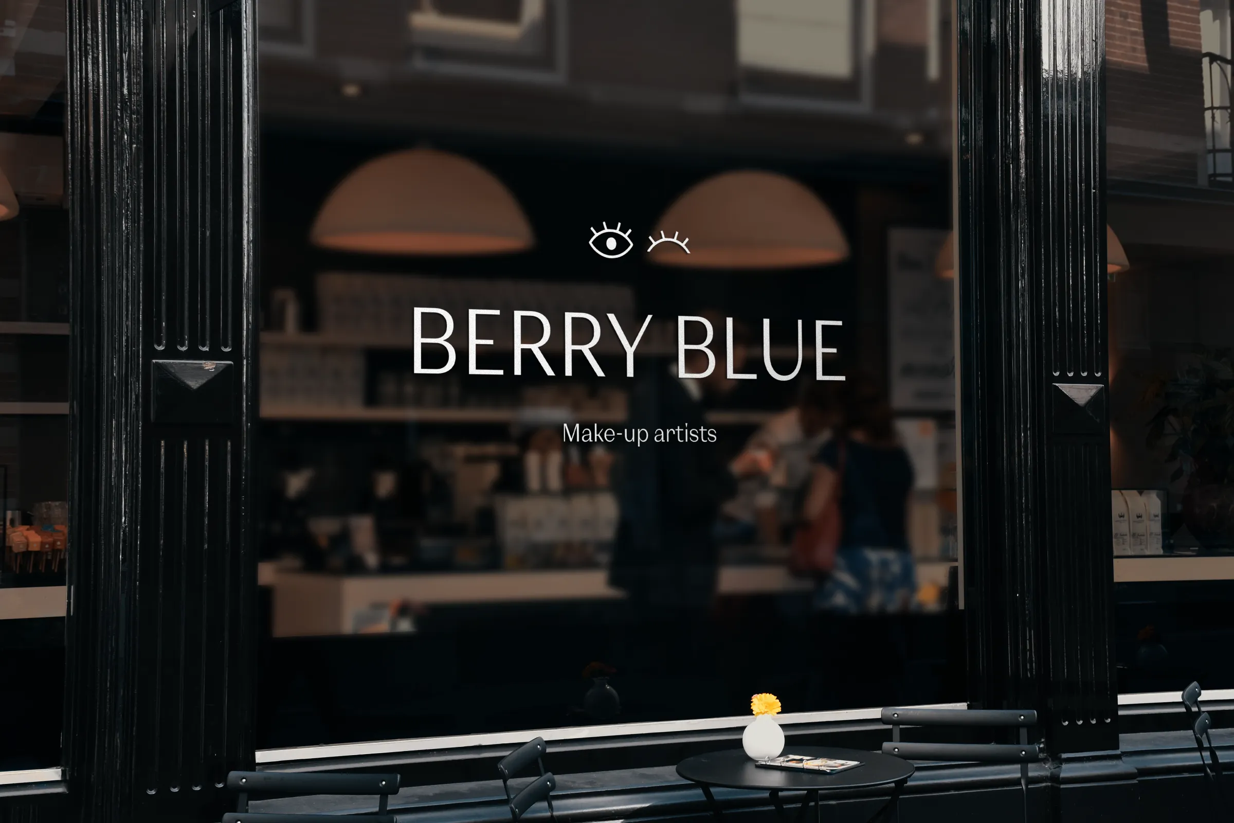
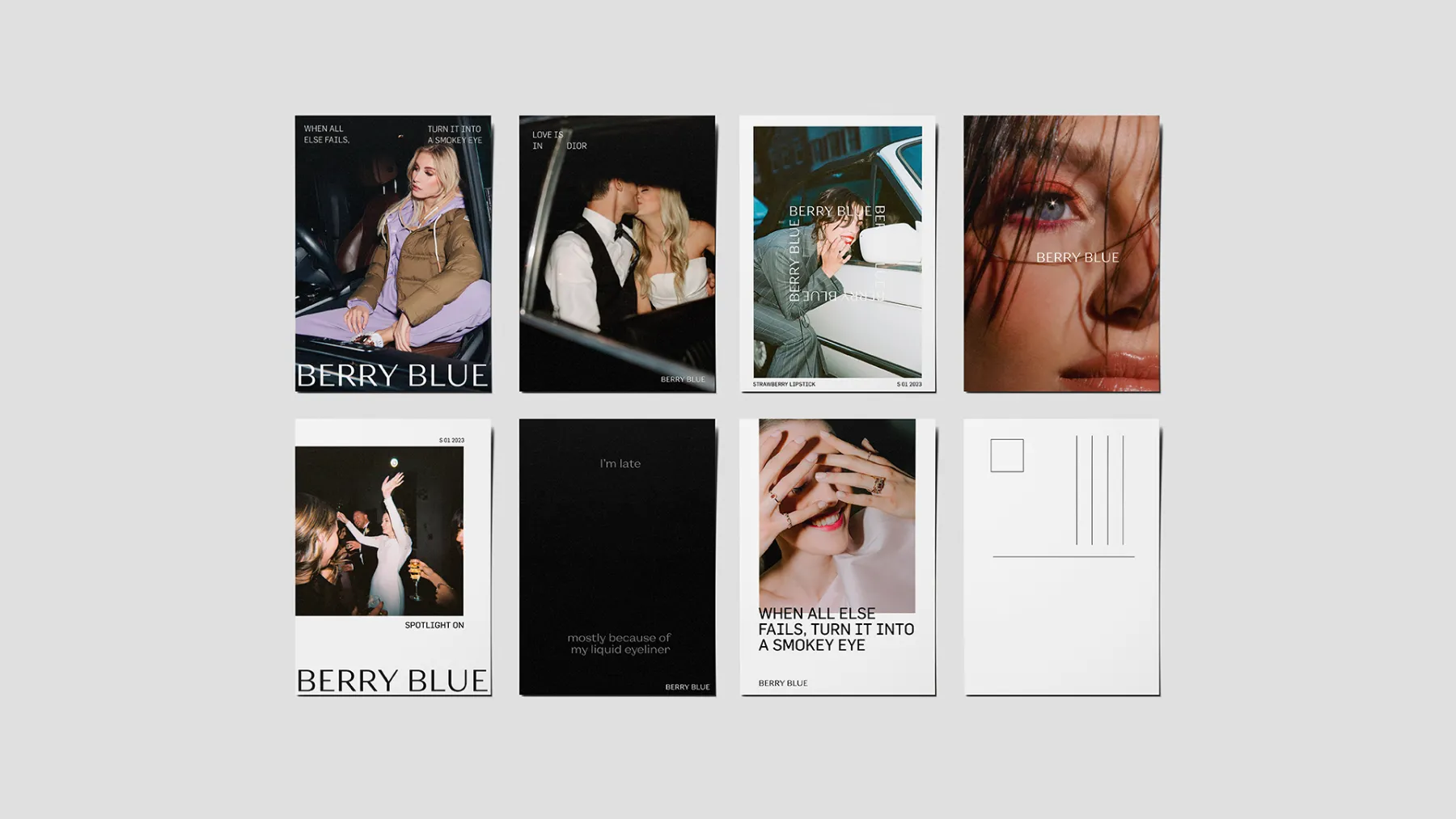
The logo is designed with a sans serif font with clear contrasts
between thick and thin, resulting in an elegant, clean and
timeless look. The use of capital letters gives the logo a
powerful and confident appearance.
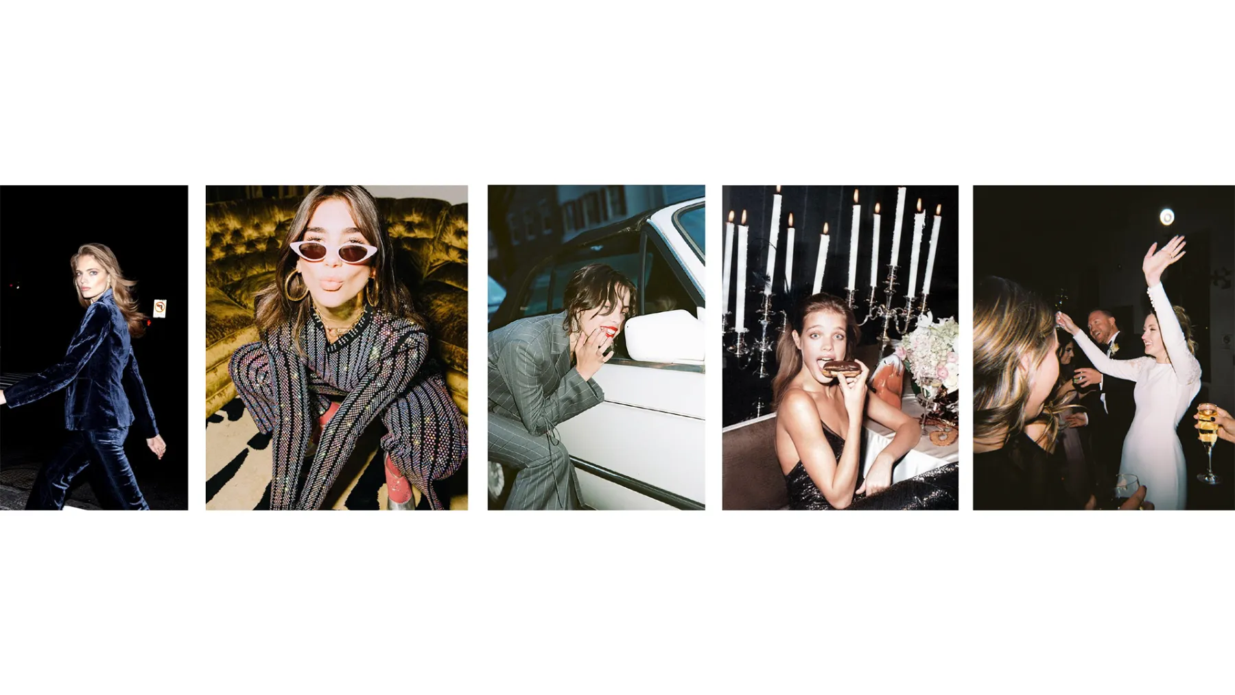
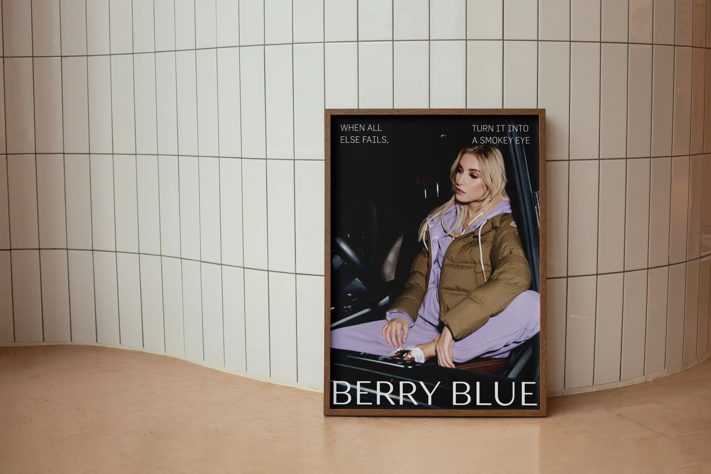
The overarching concept of "spotlight" can be translated in
several ways. In photography, this concept is taken literally by
choosing raw photography with direct flash. This approach exudes
spontaneity and almost literally translates the concept into
images, where the models are truly in the spotlight.
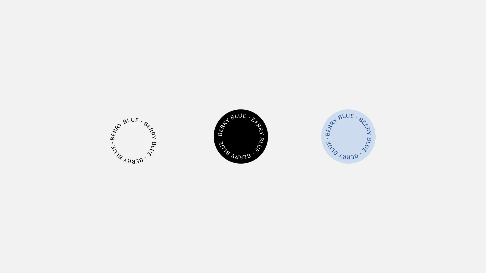
A spotlight falls like a circle on the surface. This is why we
choose to occasionally incorporate a graphic round element into
the branding.
Because Berry Blue has two contrasting audiences: traditional
brides and bold photographers, the website is visually split
into two parts. Since the customer is always the focus, it is
important that both audiences recognize themselves on the
website.
On the left for the brides: a white background provides
breathing room and soft images of brides create a recognizable
feeling.
On the right for the photographers: a black background gives a
cool and bold look, combined with flashy images to create a rock
feel.